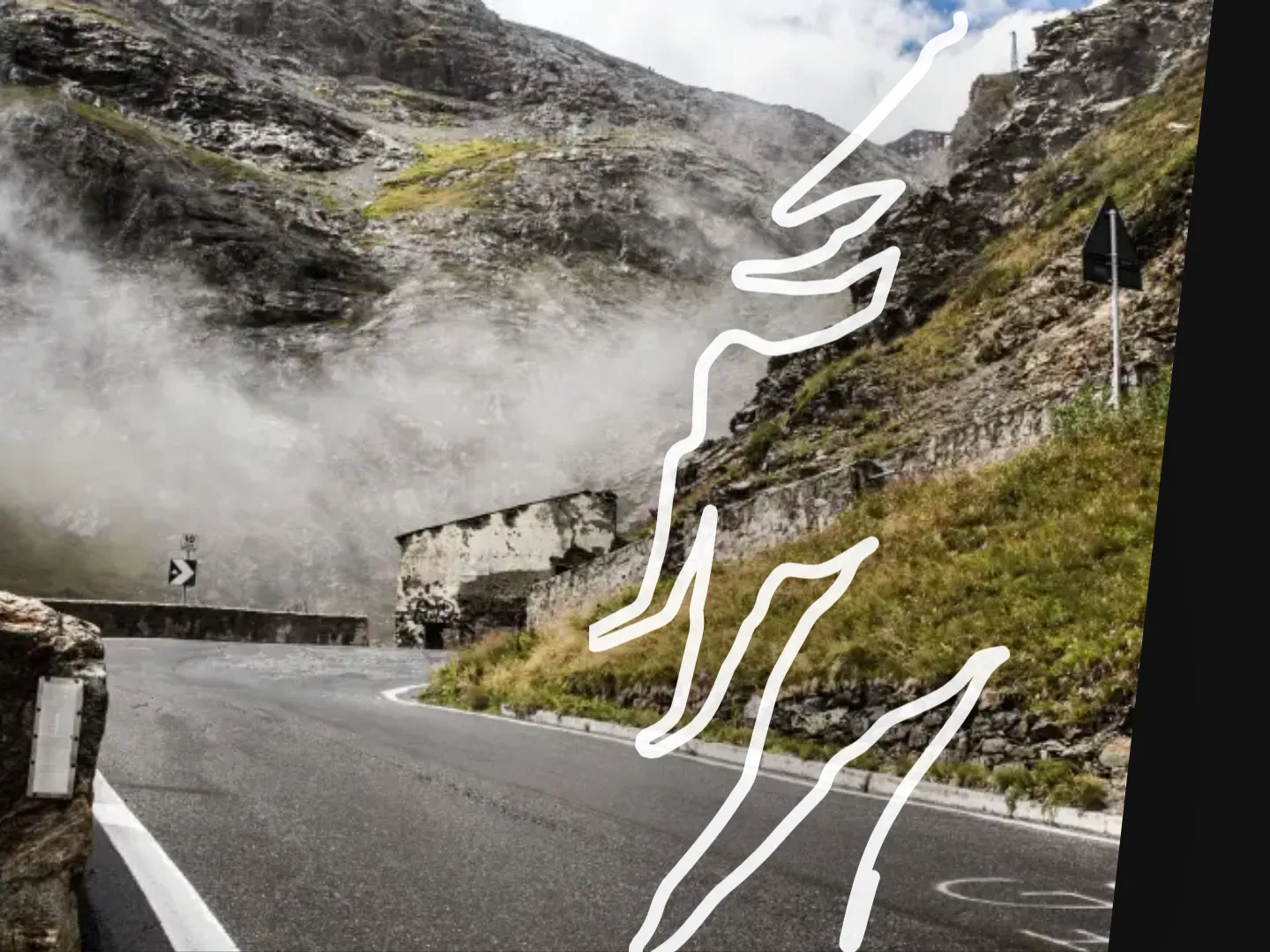
Road trace in the pass block
Every pass gets its real route as a line over the photo. It draws itself while scrolling, hairpin by hairpin. Scrolling up leaves it in place. It only resets once the block leaves the viewport at the bottom.
Case Study
A website that moves like the tours it stands for.
I have been driving Alpine passes with the club since 2014. In 2026 I rebuilt its website. Concept, design, motion and code from one hand, with one clear goal: you should feel the drive before you sign up.


02
How does a website show what a mountain pass feels like without tipping into lifestyle theatre?
Many operators sell sports car tours as glossy travel. The club is the opposite: close knit, fairly priced, with driving at its centre. The site had to feel exactly like that. Calm in tone, precise in motion, with real photos from real tours.
03
I derived the design from the club logo. Three triangles form its mountain silhouette. A single one became the sign of the brand: as list bullet, active menu item, arrow, image mask and in every signature motion.
List bullet
Arrow
Mosaic and transition
“Dark like sports car paint on a night drive.”
04
Every motion tells of driving. None is decoration, each has a trigger and an end.
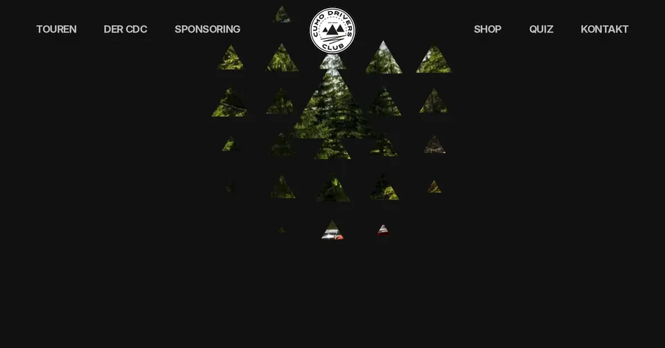 1A triangle below the logo
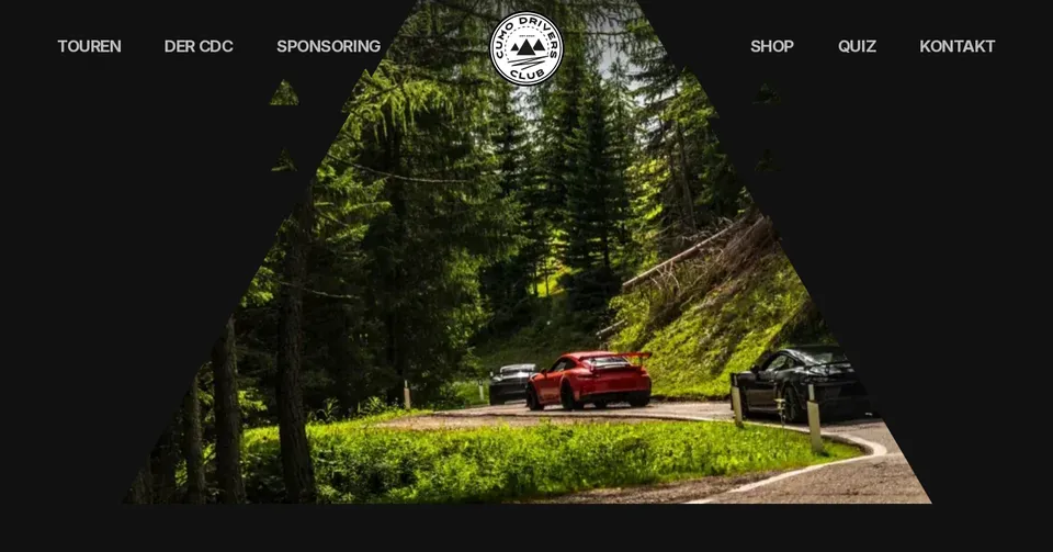 2A grid of 110 px cells grows radially
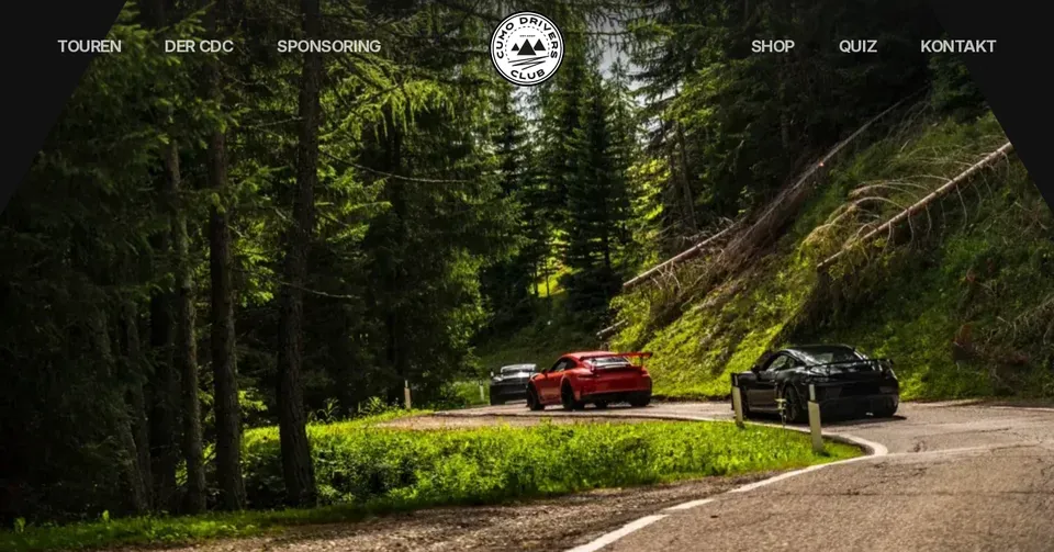 3Finale: the centre covers everything
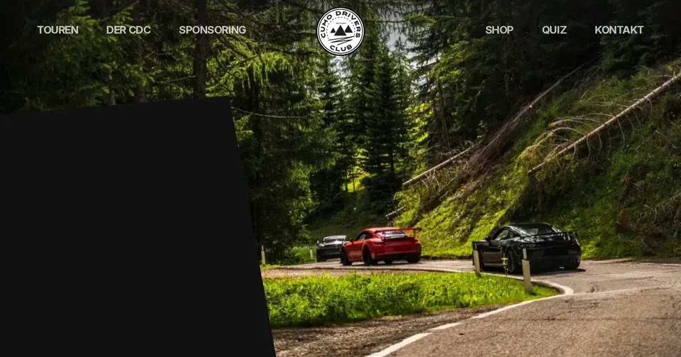 4A triangle forms the text panel
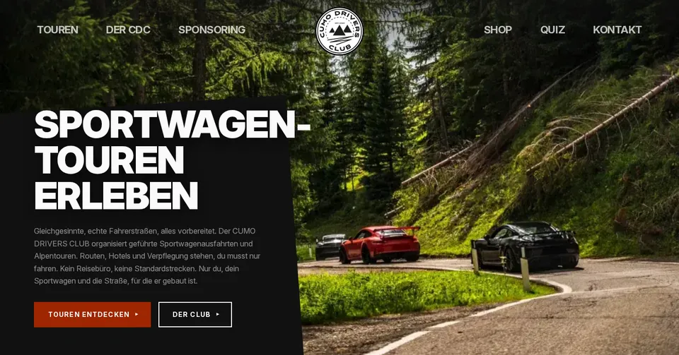 5Headline and copy appear
A canvas lays a grid of triangles over the hero photo and shows the image only inside them. The mosaic grows from the logo at 920 px per second, pulses, closes and releases the hero. Then a single triangle forms the slanted panel for the headline. The same mechanism covers the screen on page change, closing the loop from page to page.
Every pass gets its real route as a line over the photo. It draws itself while scrolling, hairpin by hairpin. Scrolling up leaves it in place. It only resets once the block leaves the viewport at the bottom.
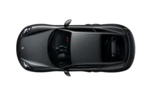
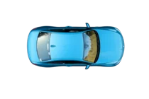
The itinerary is a road. Four cut out cars from the club drive down the centre line, swing around each day in a soft curve and steer as they go. The centre line moves like a lane marking.
On hover a triangle grows from the centre beyond the button and becomes the full rectangle. 380 ms in, 220 ms back.
On hover the ring speeds up with inertia and settles back to a full turn when the pointer leaves. On mobile and in the footer it turns continuously, 20 seconds per lap.
Page views, sample value
Page views in the footer roll up like in an instrument cluster. The rightmost digit starts first, each further one runs a little longer.
There is more: tyre smoke from two canvas layers in the tour grid and the footer, a marquee whose letters are filled with the photo, and sticky scroll stages for the founder and the sponsor case study.
05
Fast, precise, never hectic. And always switchable off.
I give motion the same rules as colour and type. Two curves, three durations, one stagger for siblings. Everything as a token, nothing hard coded. With reduced motion every signature shows its final state right away.
ease out
0.22, 1, 0.36, 1 · everything that reacts or appears
ease drive
0.16, 1, 0.3, 1 · driving motion and layout changes
Three durations
Siblings staggered in steps of 80 ms
06
The system mirrors the website code: one token block for colour, type, spacing and motion, plus 49 components from the header to the pass block. New pages are built from these components. A consistency audit turned up 15 findings, and I resolved every one.
A new component only gets built when no existing one fits.
Colours
Let us enjoy the bends together.
Inter 900 in capitals, body text 400.
Stelvio Pass
07
No framework, no animation library. Every motion is hand written.
The site runs on Vite and vanilla JS. Mosaic and tyre smoke render on canvas, routes are SVG, photos are WebP in several sizes. The pass guides are generated from source files by a build script. Analytics run without cookies. Mobile is tested at 375 px.
08
30+
Tours since 2014
62
Members from Germany, Austria and Switzerland
+292 %
Google impressions, July to October 2026
On average the club ranks on page one of Google, at position 6 for “geführte Sportwagentouren”, German for guided sports car tours. The pass guides drive most of the growth: anyone planning their next Alpine drive ends up at the club.
09
Next, the pass guides grow. Every pass gets its road trace, its facts and its story from the driver’s seat.
Let’s talk about it.